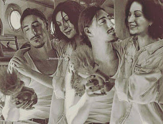
So for my final collage assignment, I decided to put my many photo-manipulations to good use and combine them into larger images as a whole. I chose not to make one large image but rather 3-4 smaller collages.
These particular photo-manipulations are characters based from my un-published novels, which in theory are just fan-fiction stories but in a much larger scale.
Small Bio: It is centered around Renee, yes I wrote myself into my story. Her parents are Sam and Dean who are brothers. Sam was cursed to bare one child by an evil witch, however at the time Sam did not know this when he was tricked by a shape-shifter who took the appearance of his brother/lover Dean. The alpha shape-shifter is dead set on getting his child back and sends out other siblings to capture her.
Character List:
Renee Winchester: Half human/ half shape-shifter. Youngest of the Winchester siblings. She doesnt know what she is, and experiences black outs where time is lost and she seems to recall other memories that are not her own.
Sam Winchester: Father/Brother and Hunter of the Supernatural
Dean Winchester:Father/Brother and Hunter of the Supernatural
Chris Winchester: The oldest sibling, who goes un-noticed because he is half demon. He is actually trying to save Renee, but the others think he is trying to hurt her.
Lucas Winchester: 2nd oldest, he is in a relationship with his younger brother Nathan, similar to their parents Sam and Dean. However, he hates Renee with a passion and everything she does he just wants her dead. Him and Nathan are the only normal ones aside from there parents.
Nathan Winchester: 3rd oldest, in a relationship with Lucas. He doesnt really have any connection with Renee or much of a relationship with her at all, he tends to side with Lucas most of the time.
Kevin Winchester: 4th in line. He was the last to come along for the boys and he doesnt have much to do with the family other then Renee. He ended up raising her most of her younger years, but then left her when he moved to Dante's Cove with his boyfriend Toby. At the cove some strange things happen where Kevin ends up becoming a warlock.
Toby: Boyfriend of Kevin and is normal. He is actually stuck between Kevin and Bro aka Ambrosious
Ambrosious: He is the powerful warlock who ends up turning Kevin while the Summer solstis happens.
It is actually really hard to described the characters because I write so many different things that all tie in with one another, but those are brief to get the idea of the kinda connection the family has with one another and how you can envision certain situations between them at certain areas of the story. I do later on switch is up where some of the relationships and moods changes towards each other.
Each image as a whole is my own creation with my face photo shoped within the images.
(Click to Enlarge each image)
Here are a few of an add in character I plan on writing into my story.
The character details are still being worked out, but he will be some kind of Love Interest to Renee.


Comments
Post a Comment