
Mixed Media Third Assignment

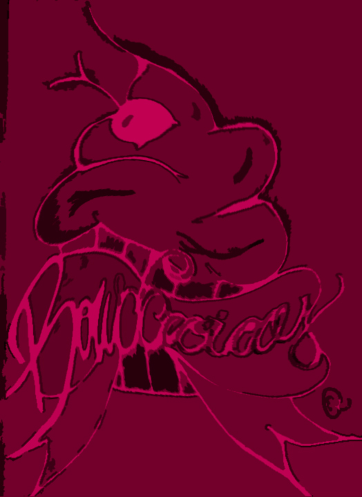
I decided for this assignment to draw again. I have not nor do I draw a lot anymore since I mainly use my phone or computer for digital images. Although I have always liked cupcakes and bows and thought okay I can draw something and then scan it into the computer and make the drawing a digital image. Thus using two different medias. I made sure to upload the original image followed by two semi different versions I created from my drawing. I added one effect with a slight swirl and I just enjoyed how it came out, I think because the way the frosting looks.
I first started with just making the frosting pink, but then I thought it would look good if the whole image was pink with the hints of black and make it more of a painting. From that point it was just playing around with filters, hue/saturation, curves and exposer.


Original Drawing

 Drawing Edited Within Adobe Photoshop
Two Versions


Comments

Popular posts from this blog

Modern Collage Artist 2nd Paper

John Stezaker  Stezaker in his marriage series, focuses on the concept of portraiture, both as art historical genre and public identity. Using publicity shots of classic film stars, Stezaker splices and overlaps famous faces, creating hybrid 'icons' that dissociate the familiar to create sensations of the uncanny. I look at his work as the earlier forms of photo-manipulations, one reason why I relate to it. Stezaker's style is very simple when you first look at it, though when you look deeper on how he matched the male and female features are stunning. It is also creepy on how alike certain opposite gender actors and actresses actually look alike. He does mainly work with portraits, but not just their faces, he also utilizes their gestures of hand placement for insistence. The one image that sticks out to me, is the one half black and white and sephia toned. Normally when I am creating my photo-manipulations, I like to make them all one color. This way it...

The Hudson Valley Inn Logos & Business Card

NEW NEW NEW When thinking about the design concepts for The Hudson Valley in, I did take into consideration for the scenery it provided for city dwellers. Although I still wanted to give it a classy cozy type feel also. I kept a color scheme of black and red, I figured a dark red would be a nice contrast to the black but also pleasing to the eye and also easy to read. I know a typical business card is horizontal, but when putting everything together, I felt as though my designs looked better in the a vertical manor. Plus I believe it gives it more of a personal touch. I made sure to have the back of the business card readable and neat, all a business card needs is basic information, and in this case information of the restaurant manager. I also made it a little authentic by having Maines actually zip code. I also added a personal touch and added a filter to the card as a hold, like a card stock with some light ridges. The Hudson Valley Inn Logos: The reason that there...

M3 CD booklet Part 2

My concept for my CD, consumed around the idea of Cocooning. Meaning everything around me is in fact me. Ether it is wrapping yourself in music/lyrics or just stuff in general. I wanted to keep the inner pages 2,7,3,6 simple so they did not  come off as to busy. Within a CD booklet, the the lyrics are at some print you should still be able to read them. When it came to the subtle images throughout the booklet, I made images that fit the song and lyrics at hand. Example: Light On by Eric Balfour "There will be a light on the planet it for you." I decided to go with an image of planet to go hand and hand, while always using my color scheme which is a pink. Now when it comes to the Puppet by Alaska Thunderfuck, I decided to make the lyrics and the song title like they are held up like strings and made a creepy version of a puppet face that fades into the background. Pages 4 and 5, I wanted it to be a poster like image that you would be able to rip out and hang...